Modals are b0rked
There is a strange thing happening in UI design. I have identified it in more than one organization. We have collectively forgotten what modals are and what they are for. Modals have become such a common pattern that product teams can't differentiate between experiences that call for modal or non-modal experiences.
If you read Therese Fessenden's exhaustive post on modals you'll find all of the conventional wisdom for the web. But the web's UI paradigms are a layer conjured up (and customized by every new framework) on a document format (HTML). This means there is no web-native standard for modals, so we should collectively dream one up. But we don't do that; we all build our own and call them whatever seems nice at the time.
The point above is an important one. We’ve seen the pendulum swing from desktop-only software, to web-only, to native-mobile-first, and we are approaching all-platforms-all-the-time-first. We went from native UI paradigms built on HCI research to inventing web approximations. We stopped relying on research and started chasing aestetics.
The issue I've observed happens when we approach cross-platform design systems. Native OS platforms are not designed for documents, but for interactive applications. Meaning they natively define application paradigms (like modals). This leads to tons of varation across native platforms, but also with the web. I have started to create some additional guidance for translation between all three platforms, so I want to share my work.
First, what do modals do?
Modals are interfaces that appear on top of the main window, moving the system into a second mode requiring user interaction. This interface disables the main window until the user explicitly interacts with the modal.
I use window here as it was initially used in desktop software and provides a clear understanding of application flow (clearer than content). The concept of modals did not exist prior to the Xerox Alto in 1973. It was the first machine designed around a GUI and it contained a word processor whose creators included Larry "NO MODES" Tesler.
Modal vs. Sheet vs. Alert
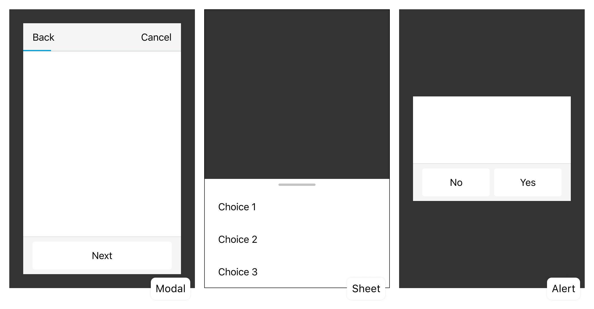
fig 1 Every one of these is a type of modal; we should be explicit about that.
We primarily have 3 types of modal content. Multi-action, Single-action, and Blocking-action. These three types of modals share some patterns, but all serve as a valuable use case that spans platforms.
Modals
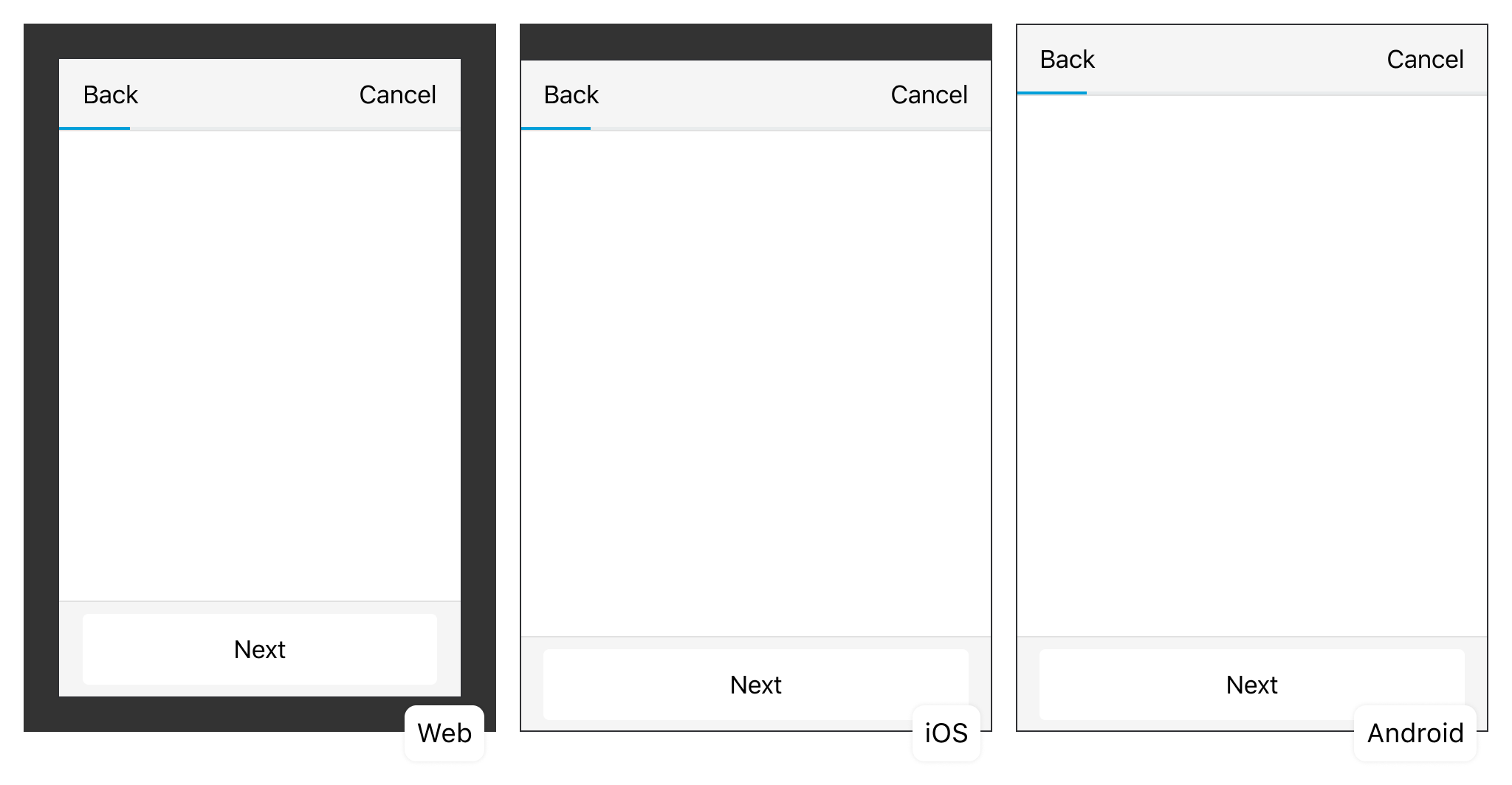
fig 2 Modals exist on every platform, Android treats it like a "fullscreen view".
Lightbox-style (web 2.0?) modals are the classic web pattern. iOS has moved to a similar default presentation style in what appears to be an attempt to unify platforms. Android is the outlier; in their material docs they bury the concept of a full-screen-bottom-sheet (shakes fist). These are all capable of being used as Primary (multi-action) modals.
Sheets
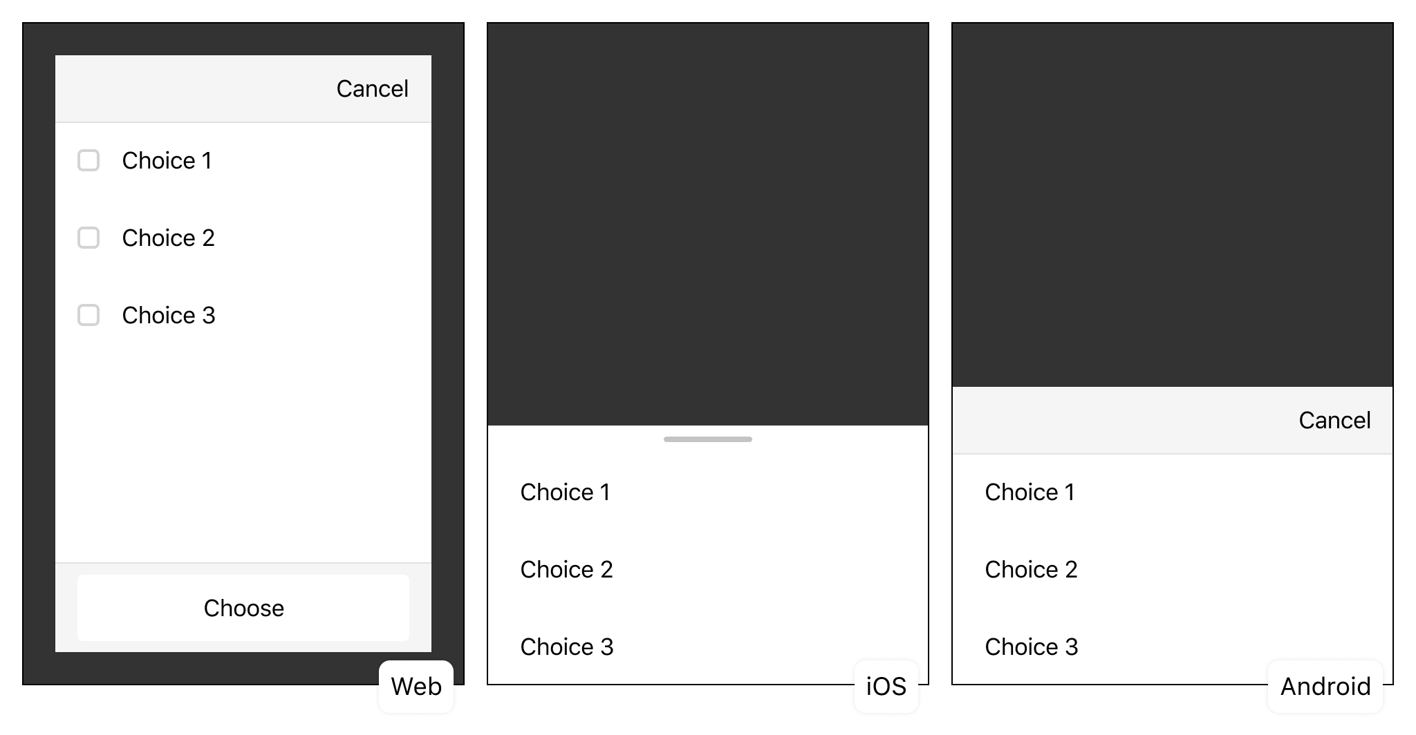
fig 3 Sheets don't exist on every platform, the Web usually treats it like a "modal without progress".
Sheets feels almost like a new idea cooked up by Material Design. This concept bled over into iOS via the pageSheet and formSheet presentation style. Both of which are woefully under-documented. These are very often derived from common web layouts that need to fit mobile devices. The web lacks this concept, but begs for a secondary, simplified, single-action modal.
Alerts
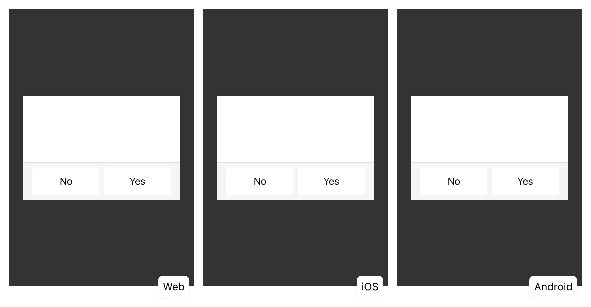
fig 4 Alerts exist on every platform, the Web usually tries to avoid the window alert pattern in favor of an in-page alert.
Alerts are another pattern born of the window paradigm. Many (all?) web frameworks have poached the concept and implemented a version of it as an alert header, force-dismiss toast, or as an alert modal. These are all reasonable solutions, but depending on your system one should likely be the default translation from the native alert pattern.
That's it, they are all modals!
You can take the images above and stack them into a matrix for emphasis. It seems really simple now, but I have seen modals unravel for a lot of folks. This causes wasted time in meetings defining modality over and over across platforms. It consumed at least a few incredible designers for the better part of a year.
Hopefully this can help product teams avoid that effort by normalizing the idea of modality across platforms. I will be the first to say that there are likely flaws here or missing optimizations. But this abstraction has helped align cross-platform design and engineering teams in the past.
If you have questions or improvements, reach out on email or twitter. I'd love to discuss this further in most any forum.